2022.04.10 ~ 2022.04.14

10주차부터는 SQL 실습이 시작되었다. 이제 정말 스타터스 교육 과정의 막바지여서 기대반 걱정반으로 마지막 프로젝트를 기다리며 하루하루를 보내고 있는데 와중에 SQL 실습도 그리 녹록치는 않았다. 개인 과제와 팀 프로젝트, 극악의 밸런스 게임이었다.. 그리고 마지막 프로젝트에서 태블로와 SQL을 동시에 활용해야 하는 부분에 대해서 슬슬 걱정이 되기 시작했다. 무엇을 태블로로 작업하고 무엇을 SQL로 접근해야 하는지?
그래서 이번 주 학습일지에서는 지표 추출 쿼리들을 복습하고 시각화까지 연습하려 한다.
목차
매출지표 일반
- 매출액, 구매자수, 주문건수
- ARPPU, AOV
매출지표 고급
- 매출증감
- 매출누계
- 이동평균
- ABC 분석
- Z차트
매출지표 일반
1. 매출액, 구매자수, 주문건수
월별 매출액, 구매자수, 주문건수
-- 월별 매출액, 구매자수, 주문건수
select
	to_char(order_date, 'yyyy-mm') orderdate,
	round(sum(unit_price * quantity * (1 - discount))::numeric, 2) sales,
	count(distinct o.customer_id) customercnt,
	count(distinct o.order_id) ordercnt
from orders o join order_details od on o.order_id = od.order_id
group by orderdate
order by orderdate
>>
시각화
plt.figure()

fig, ax1 = plt.subplots(figsize=(20, 5))
ax1.bar(orderdate, sales, color='skyblue', width=0.5, ec='lightgray', label='height')

ax2 = ax1.twinx()
ax2.plot(orderdate, ordercnt, color='darkred', marker='o', ls='-.', label='weight')
ax3 = ax1.twinx()
ax3.plot(orderdate, customercnt, color='orange', marker='o', ls='-.', label='weight')
plt.show()
카테고리별 매출액, 구매자수, 주문건수
사전 준비
- 준비 1) 필요한 테이블 조인, 필요한 데이터 추출
-- with절 생성
with cte_sales as (
select
	o.order_id,
	o.customer_id,
	o.order_date,
	to_char(o.order_date, 'yyyy') as year,
	to_char(o.order_date, 'mm') as month,
	to_char(o.order_date, 'dd') as day,
	to_char(o.order_date, 'q') as quarter,
	od.product_id,
	p.unit_price as master_price,
	od.unit_price as sales_price,
	od.quantity,
	od.discount,
	od.unit_price * od.quantity * (1 - od.discount) sales,
	c.category_id,
	c.category_name,
	p.product_name,
	p.discontinued,
	s.supplier_id,
	s.company_name,
	s.country,
	s.city
from orders o
join order_details od on o.order_id = od.order_id
join products p on p.product_id = od.product_id
join categories c on  c.category_id = p.category_id
join suppliers s on s.supplier_id = p.supplier_id
order by od.product_id
)- 준비 2) 속성별 grouping sets
with cte_sales as (
-- 생략
)
-- 제품속성별 grouping sets
), cte_grouping_sets as (
select
category_name,
product_name,
company_name,
country,
city,
round(sum(sales)::numeric, 2) as 매출액,
count(distinct customer_id) as 고객수,
count(distinct order_id) as 주문건수
from cte_sales
group by grouping sets(1,2,3,4,(4,5),())
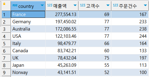
)카테고리별 매출액, 구매자수, 주문건수
-- 카테고리별 매출액, 구매자수, 주문건수만 추출
, cte_category_sales as (
select
	category_name,
	매출액,
        고객수,
        주문건수
from cte_grouping_sets
where category_name is not null
)
select *
from cte_category_sales
order by 매출액 desc
>>
시각화
plt.figure()

fig, ax1 = plt.subplots(figsize=(20, 5))
ax1.bar(category_name, 매출액, color='skyblue', width=0.5, ec='lightgray', label='height')

ax2 = ax1.twinx()
ax2.plot(category_name, 고객수, color='darkred', marker='o', ls='-.', label='weight')
ax3 = ax1.twinx()
ax3.plot(category_name, 주문건수, color='orange', marker='o', ls='-.', label='weight')
plt.show()
제품별 매출액, 구매자수, 주문건수
-- 제품별 매출액, 구매자수, 주문건수만 추출
, cte_product_sales as (
select
	product_name,
	매출액,
        고객수,
        주문건수
from cte_grouping_sets
where product_name is not null
)
select *
from cte_product_sales
order by 매출액 desc
>>

공급업체별 매출액, 구매자수, 주문건수
-- 공급사별 매출액, 구매자수, 주문건수만 추출
, cte_company_sales as (
select
	company_name,
	매출액,
        고객수,
        주문건수
from cte_grouping_sets
where company_name is not null
)
select *
from cte_company_sales
order by 매출액 desc
>>

국가별 매출액, 구매자수, 주문건수
-- 국가별 매출액, 구매자수, 주문건수만 추출
, cte_country_sales as (
select
	country,
	매출액,
        고객수,
        주문건수
from cte_grouping_sets
where country is not null and city is null
)
select *
from cte_country_sales
order by 매출액 desc
>>
국가-도시별 매출액, 구매자수, 주문건수
-- 국가-도시별 매출액, 구매자수, 주문건수만 추출
, cte_country_city_sales as (
select
	country,
	city,
	매출액,
        고객수,
        주문건수
from cte_grouping_sets
where (country, city) is not null
order by 1
)
select *
from cte_country_city_sales
order by 매출액 desc
>>

전체 매출액, 구매자수, 주문건수
-- 전체 매출액, 구매자수, 주문건수 추출
, cte_total_sales as (
select
	매출액,
        고객수,
        주문건수
from cte_grouping_sets
order by 매출액 desc
limit 1
)
select *
from cte_total_sales
>>

2. ARPPU, AOV
※ ARPPU(Average Revenue Per Paying User, 인당 매출액) , AOV(Average Order Value, 건당 구매금액)
월별 ARPPU, AOV
with sub as (
select
    to_char(order_date, 'yyyy-mm') orderdate,
    round(sum(unit_price * quantity * (1 - discount))::numeric, 2) sales,
    count(distinct o.order_id) ordercnt,
    count(distinct o.customer_id) customercnt
from orders o join order_details od on o.order_id = od.order_id
group by orderdate
order by orderdate
)
select
    orderdate,
    round((sales / customercnt), 2) 인당매출액,
    round((sales / ordercnt), 2) 건당구매금액
from sub
>>

시각화
plt.figure()

fig, ax1 = plt.subplots(figsize=(20, 5))
ax1.plot(orderdate, 인당매출액,color='orange', marker='o', ls='-.', label='weight')

ax2 = ax1.twinx()
ax2.plot(orderdate, 건당구매금액, color='darkred', marker='o', ls='-.', label='weight')
plt.show()
매출지표 고급
1. 매출증감
월별 매출, 증감액, 비율
), cte_pre_amount as (
select
    to_char(order_date, 'yyyy-mm') orderdate,
    sum(sales) sales
from cte_sales
group by 1
order by 1
)
select
	orderdate,
	sales as 월별매출,
	lag(sales) over (order by year,month) as 전월매출,
	sales - lag(sales) over (order by year,month) as 전월대비증감액,
	round((sales / lag(sales) over (order by year,month) * 100)::numeric, 2)::varchar(10)||'%' as 전월대비매출액비율,
	case
		when sales - lag(sales) over (order by year,month) > 0 then '▲'
		when sales - lag(sales) over (order by year,month) < 0 then '▼'
		when sales - lag(sales) over (order by year,month) is null then '해당없음'
		when sales - lag(sales) over (order by year,month) = 0 then '동일'
	end as 증감여부
from cte_pre_amount
>>

시각화
plt.figure()

fig, ax = plt.subplots(figsize=(20, 5))
ax.plot(orderdate, 매출액, color='skyblue', marker='o', ls='-.', label='weight')
ax.plot(orderdate, 전월매출액, color='orange',marker='o', ls='-.', label='weight')
ax.bar(orderdate, 전월대비증감액, color='darkred', width=0.5, ec='lightgray', label='height')
plt.show()
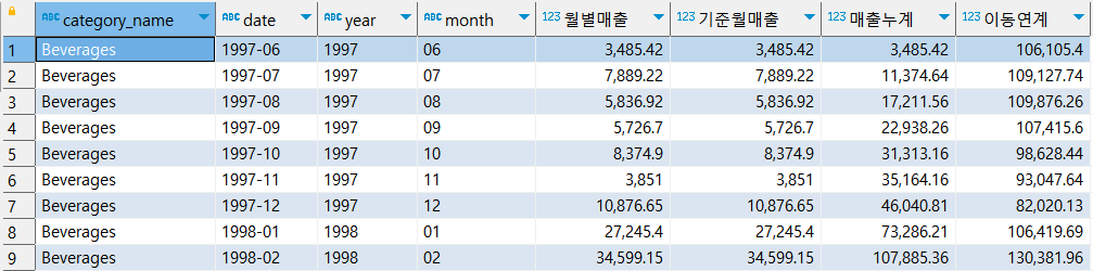
2. 매출누계
일자별/월별 누적 매출액
), a as (
select
	year,
	month,
	day,
	round(sum(sales)::numeric, 2) 일자별매출
from cte_order_tbl
group by 1,2,3
order by 1,2,3
)
select
	year,
	month,
	day,
	일자별매출,
	sum(일자별매출) over (order by year, month, day) 일자별매출누계,
	sum(일자별매출) over (partition by year, month order by year, month) 월별매출,
	sum(일자별매출) over (order by year, month) 월별매출누계
from a
>>

시각화
- 일자별 매출
plt.figure()

fig, ax1 = plt.subplots(figsize=(20, 5))
ax1.bar(orderdate, 일자별매출누계, width=1, label='height')

ax2 = ax1.twinx()
ax2.plot(orderdate, 일자별매출, color='darkred', ls='-', label='weight')

plt.show()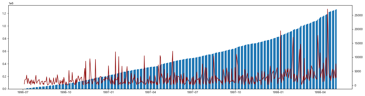
- 월별 매출
plt.figure()

fig, ax1 = plt.subplots(figsize=(20, 5))
ax1.bar(orderdate, 월별매출누계, width=1, label='height')

ax2 = ax1.twinx()
ax2.plot(orderdate, 월별매출, color='darkred', ls='-', label='weight')

plt.show()
3. 이동평균
), cte_ordercnt_tbl as (
select
	year,
	month,
	day,
	round(sum(sales)::numeric, 2) 매출액
from cte_sales
group by 1,2,3
order by 1,2,3
)
select *,
	round(avg(매출액) over (order by year, month, day rows between 4 preceding and current row)::numeric, 2) as "5일이동평균",
	count(매출액) over (order by year, month, day rows between 4 preceding and current row) as cnt,
	case
		when count(매출액) over (order by year, month, day rows between 4 preceding and current row) = 5 then
		avg(매출액) over (order by year, month, day rows between 4 preceding and current row)
	end as "5일이동평균"
from cte_ordercnt_tbl
>>

시각화
plt.figure()

fig, ax1 = plt.subplots(figsize=(20, 5))
ax1.plot(orderdate, 매출액,color='orange', ls='-.', label='weight')

ax2 = ax1.twinx()
ax2.plot(orderdate, 이동평균, color='darkred', ls='-.', label='weight')
plt.show()
4. ABC 분석
ABC 분석 방법
step 1. 매출액이 많은 순으로 정렬한다
step 2. 총 매출액을 100%로 하여 제품별 구성비를 산출한다
step 3. 구성비 상위의 제품부터 순서대로 구성비누계를 산출한다
step 4. 그래프의 세로축은 구성비누계, 가로축은 제품을 기입한다
step 5. 구성비누계 70%까지를 A그룹, 90%까지를 B그룹, 그 이상을 C그룹으로 분류한다
✔ A그룹을 고객관리의 최중점목표로 하여 대책을 강구한 다음, B,C 그룹으로 옮겨 간다
-- 상품별 매출액, 구성비 구하기
with cte_products_sale as (
-- 생략
), a as (
select
	product_id,
	product_name,
	round(sum(sales)::numeric, 1) as 매출액,
	round(((sum(sales) / sum(sum(sales)) over ()) * 100)::numeric,2) as 구성비
from cte_products_sale
group by 1,2
order by 4 desc
)
>>

-- ABC 그룹 나누기
select
	product_id,
	product_name,
	매출액,
	구성비,
	sum(구성비) over (order by 구성비 desc) as 구성비누계,
	case
		when sum(구성비) over (order by 구성비 desc) <= 70 then 'A'
		when sum(구성비) over (order by 구성비 desc) <= 90 then 'B'
		else 'C'
	end as 등급
from a
>>

시각화
plt.figure()

fig, ax1 = plt.subplots(figsize=(20, 5))
ax1.bar(df['product_name'], df['구성비'], color='darkred', width=0.5, ec='lightgray', label='height')

ax2 = ax1.twinx()
ax2.plot(df['product_name'], df['구성비누계'], color='skyblue', marker='o', ls='-.', label='weight')

plt.show()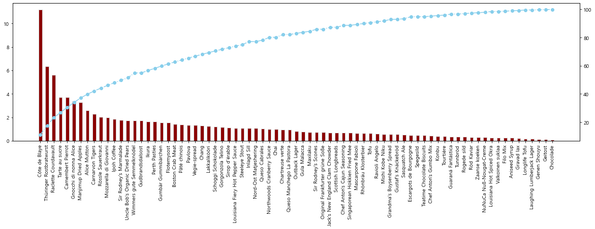
5. Z차트
전체 Z차트
), a as (
select
	to_char(order_date, 'yyyy-mm') date,
	year,
	month,
	sum(sales) as 월별매출
from cte_sales
group by date, year, month
order by year, month
), b as (
select
	date,
	year,
	month,
	round(월별매출::numeric, 2) 월별매출 ,
	case
		when date between '1997-06' and '1998-04' then round(월별매출::numeric, 2)
		else 0
	end 기준월매출
from a
), c as (
select
    date,
	year,
	month,
	월별매출,
	기준월매출,
	round((sum(기준월매출) over (order by year, month))::numeric, 2) 매출누계
from b
), d as (
select
    date,
	year,
	month,
	월별매출,
	기준월매출,
	매출누계,
	round((sum(월별매출) over (order by year, month rows between 10 preceding and current row))::numeric, 2) 이동연계
from c
)
select
*
from d
where date between '1997-06' and '1998-04';
>>

시각화
plt.figure()

fig, ax = plt.subplots(figsize=(20, 5))
ax.plot(df['date'], df['월별매출'], color='orange', marker='o', ls='-.', label='weight')
ax.plot(df['date'], df['매출누계'], color='blue', marker='o', ls='-.', label='weight')
ax.plot(df['date'], df['이동연계'], color='red', marker='o', ls='-.', label='weight')
plt.show()
카테고리별 Z차트
), a as (
select
	category_name,
	to_char(order_date, 'yyyy-mm') date,
	year,
	month,
	sum(sales) as 월별매출
from cte_sales
group by 1,2,3,4
order by 1,2
), b as (
select
	category_name,
	date,
	year,
	month,
	round(월별매출::numeric, 2) 월별매출 ,
	case
		when date between '1997-06' and '1998-04' then round(월별매출::numeric, 2)
		else 0
	end 기준월매출
from a
), c as (
select
	category_name,
    date,
	year,
	month,
	월별매출,
	기준월매출,
	round((sum(기준월매출) over (partition by category_name order by year, month))::numeric, 2) 매출누계
from b
), d as (
select
	category_name,
    date,
	year,
	month,
	월별매출,
	기준월매출,
	매출누계,
	round((sum(월별매출) over (partition by category_name order by year, month rows between 10 preceding and current row))::numeric, 2) 이동연계
from c
order by 1,2,3
)
select
*
from d
where date between '1997-06' and '1998-04';
>>
시각화
# 전체 그래프의 크기 지정
plt.figure(figsize=(20,10))

# 1사분면 위치에 df1 그래프 그리기
plt.subplot(241)
plt.plot(df1['date'], df1['월별매출'], color='orange', marker='o', ls='-.', label='weight')
plt.plot(df1['date'], df1['매출누계'], color='blue', marker='o', ls='-.', label='weight')
plt.plot(df1['date'], df1['이동연계'], color='red', marker='o', ls='-.', label='weight')

plt.subplot(242)
plt.plot(df2['date'], df2['월별매출'], color='orange', marker='o', ls='-.', label='weight')
plt.plot(df2['date'], df2['매출누계'], color='blue', marker='o', ls='-.', label='weight')
plt.plot(df2['date'], df2['이동연계'], color='red', marker='o', ls='-.', label='weight')

plt.subplot(243)
plt.plot(df3['date'], df3['월별매출'], color='orange', marker='o', ls='-.', label='weight')
plt.plot(df3['date'], df3['매출누계'], color='blue', marker='o', ls='-.', label='weight')
plt.plot(df3['date'], df3['이동연계'], color='red', marker='o', ls='-.', label='weight')

plt.subplot(244)
plt.plot(df4['date'], df4['월별매출'], color='orange', marker='o', ls='-.', label='weight')
plt.plot(df4['date'], df4['매출누계'], color='blue', marker='o', ls='-.', label='weight')
plt.plot(df4['date'], df4['이동연계'], color='red', marker='o', ls='-.', label='weight')

plt.subplot(245)
plt.plot(df5['date'], df5['월별매출'], color='orange', marker='o', ls='-.', label='weight')
plt.plot(df5['date'], df5['매출누계'], color='blue', marker='o', ls='-.', label='weight')
plt.plot(df5['date'], df5['이동연계'], color='red', marker='o', ls='-.', label='weight')

plt.subplot(246)
plt.plot(df6['date'], df6['월별매출'], color='orange', marker='o', ls='-.', label='weight')
plt.plot(df6['date'], df6['매출누계'], color='blue', marker='o', ls='-.', label='weight')
plt.plot(df6['date'], df6['이동연계'], color='red', marker='o', ls='-.', label='weight')

plt.subplot(247)
plt.plot(df7['date'], df7['월별매출'], color='orange', marker='o', ls='-.', label='weight')
plt.plot(df7['date'], df7['매출누계'], color='blue', marker='o', ls='-.', label='weight')
plt.plot(df7['date'], df7['이동연계'], color='red', marker='o', ls='-.', label='weight')

plt.subplot(248)
plt.plot(df8['date'], df8['월별매출'], color='orange', marker='o', ls='-.', label='weight')
plt.plot(df8['date'], df8['매출누계'], color='blue', marker='o', ls='-.', label='weight')
plt.plot(df8['date'], df8['이동연계'], color='red', marker='o', ls='-.', label='weight')


plt.show()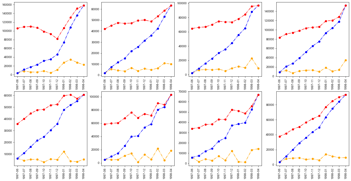
태블로 시각화까지 하고 싶었는데 돌아오는 주에 시간이 될지 모르겠다. 금요일에는 최종 테스트도 있고... 이렇게 끝나 가는구나😇
>> 유데미 바로가기
>> STARTERS 취업 부트캠프 공식 블로그 보러가기
본 후기는 유데미-웅진씽크빅 취업 부트캠프 4기 데이터 분석 과정 학습 일지 리뷰로 작성되었습니다.
#유데미 #유데미코리아 #유데미큐레이션 #유데미부트캠프 #취업부트캠프 #스타터스부트캠프 #데이터시각화 #데이터분석 #데이터드리븐 #태블로
'유데미 스타터스 데이터 분석' 카테고리의 다른 글
| 유데미 스타터스 취업 부트캠프 4기 - 데이터분석/시각화(태블로) 12주차 학습 일지 (4) | 2023.05.09 |
|---|---|
| 유데미 스타터스 취업 부트캠프 4기 - 데이터분석/시각화(태블로) 11주차 학습 일지 (0) | 2023.04.23 |
| 유데미 스타터스 취업 부트캠프 4기 - 데이터분석/시각화(태블로) 9주차 학습 일지 (0) | 2023.04.09 |
| 유데미 스타터스 취업 부트캠프 4기 - 데이터분석/시각화(태블로) 8주차 학습 일지 (0) | 2023.04.02 |
| 유데미 스타터스 취업 부트캠프 4기 - 데이터분석/시각화(태블로) 7주차 학습 일지 (1) | 2023.03.26 |


댓글