유데미 스타터스 취업 부트캠프 4기 - 데이터분석/시각화(태블로) 4주차 학습 일지(1)
유데미 스타터스 취업 부트캠프 4기 - 데이터분석/시각화(태블로) 4주차 학습 일지(2)
유데미 스타터스 취업 부트캠프 4기 - 데이터분석/시각화(태블로) 4주차 학습 일지(3)
데이터 분석을 위한 파이썬 로드맵(내가 보려고 만듦)
시각화
1) Matplotlib
라이브러리 준비
import pandas as pd
import matplotlib.pyplot as plt
# 그래프에 한글 설정
plt.rc('font',family='Malgun Gothic')
# 그래프에 마이너스 기호 깨지는 문제 해결
plt.rcParams['axes.unicode_minus'] = False
막대 그래프
df1 = pd.DataFrame({'요일':['월','화','수','목','금','토','일'],
                   '매출액':[10000,9000,11000,8000,13000,15000,14000]})
df2 = pd.DataFrame({'요일':['월','화','수','목','금','토','일'],
                   '매출액':[9000,9500,13000,7000,12000,14000,11000]})

plt.bar(df1['요일'],df1['매출액'], width=-0.4, align='edge')
plt.bar(df2['요일'],df2['매출액'], width=0.4, align='edge')
plt.title('두 매장의 요일별 매출액 평균', size=15)
plt.grid(axis='y', ls=':')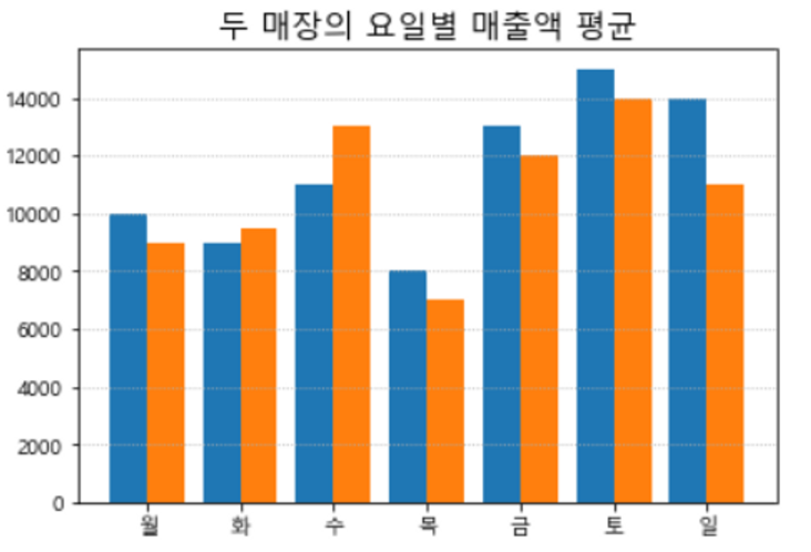
산점도
import seaborn as sns
tips = sns.load_dataset('tips')

# 성별에 따른 color 지정
def set_color(x):
    if x=='Male':
        return 'blue'
    elif x=='Female':
        return 'red'

tips['color'] = tips['sex'].apply(set_color)

# 점의 크기와 색상 지정
plt.scatter(tips['total_bill'], tips['tip'], s=tips['size']*50, alpha=0.5, c=tips['color'])
히트맵
import seaborn as sns
titanic = sns.load_dataset('titanic')
titanic['agerange'] = (titanic['age']/10).astype('int')*10
titanic_pivot = titanic.pivot_table(index='class', columns='agerange', values='survived', aggfunc='count')

# 눈금 준비
np.arange(0.5,len(titanic_pivot.columns),1)

# 눈금 지정
plt.xticks(np.arange(0.5,len(titanic_pivot.columns),1), labels=titanic_pivot.columns)
plt.yticks(np.arange(0.5,len(titanic_pivot.index),1), labels=titanic_pivot.index)

# 그래프 그리기
plt.pcolor(titanic_pivot)
plt.colorbar()
plt.show()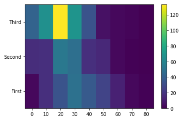
히스토그램
plt.hist(scores, bins=20)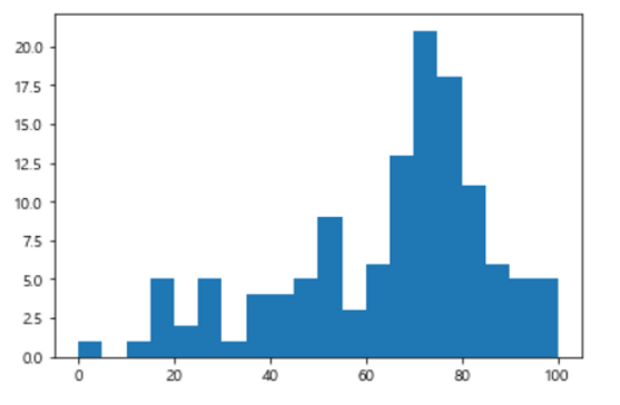
박스플롯
plt.boxplot([ iris['sepal_length'], iris['sepal_width'], iris['petal_length'], iris['petal_width']    ]
           , labels=['sepal_length', 'sepal_width','petal_length','petal_width']
           , showmeans=True)
plt.grid(axis='y')
plt.show()
바이올린 플롯
plt.violinplot([iris['sepal_length'], iris['sepal_width'], iris['petal_length'], iris['petal_width']]
              , showmeans=True, showmedians=True)
plt.xticks(range(1,5,1), labels=['sepal_length','sepal_width','petal_length','petal_width'])
plt.show()
파이차트
plt.figure(figsize=(5,5), facecolor='ivory', edgecolor='gray', linewidth=2)
plt.pie(Personnel, labels=blood_type, labeldistance = 1.2, autopct ='%.1f%%', pctdistance=0.6
       , explode=[0.1,0,0,0]
       , colors =['lightcoral', 'gold', 'greenyellow', 'skyblue']
       , startangle=90
       , counterclock = False
       , radius=1
       , wedgeprops = {'ec':'k', 'lw':1,'ls':':' ,'width':0.7}
       , textprops = {'fontsize':12, 'color':'b', 'rotation':0})

plt.title('2019년 병역판정검사 - 혈액형 분포', size=15)
plt.show()
수직, 수평선 그리기
import seaborn as sns
tips = sns.load_dataset('tips')

plt.figure(figsize=(15,3))
plt.barh(s.index, s.values)
plt.xticks(range(0,91,1), rotation=90)
plt.grid(axis='x')

# 수직선 그리기
plt.axvline(s['Fri'], color='k')
plt.axvline(s['Thur'], color='k')
plt.axvline(s['Sun'], color='k')
plt.axvline(s['Sat'], color='k')

plt.show()
2) seaborn
막대그래프
sns.barplot(data=tips, x='day', y='tip', ci=None, estimator=sum, hue='smoker')
plt.title('요일별 팁 합계', size=15)
plt.show()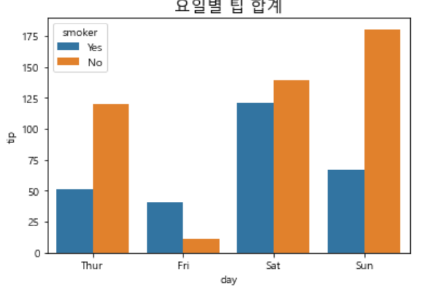
산점도
sns.scatterplot(data=tips, x='total_bill', y='tip', hue='day', size='size', alpha=0.5)
plt.show()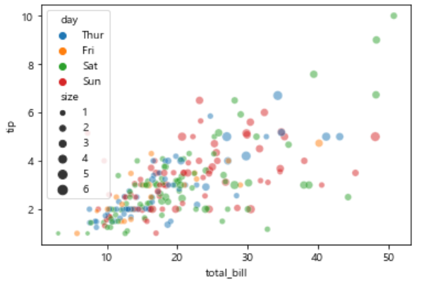
선그래프
sns.lineplot(data=flights, x='year', y='passengers', ci=None, estimator=sum, color='r', marker='o', ls=':')
plt.show()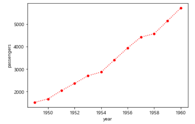
히트맵
sns.heatmap(titanic_pivot, cmap='Blues', annot=True, fmt='d')
plt.show()
'유데미 스타터스 데이터 분석' 카테고리의 다른 글
| 유데미 스타터스 취업 부트캠프 4기 - 데이터분석/시각화(태블로) 5주차 학습 일지 (0) | 2023.03.12 |
|---|---|
| 유데미 스타터스 취업 부트캠프 4기 - 데이터분석/시각화(태블로) 4주차 학습 일지(4) (2) | 2023.03.10 |
| 유데미 스타터스 취업 부트캠프 4기 - 데이터분석/시각화(태블로) 4주차 학습 일지(2) (0) | 2023.03.09 |
| 유데미 스타터스 취업 부트캠프 4기 - 데이터분석/시각화(태블로) 4주차 학습 일지(1) (0) | 2023.03.05 |
| 유데미 스타터스 취업 부트캠프 4기 - 데이터분석/시각화(태블로) 3주차 학습 일지 (0) | 2023.02.26 |
댓글